The NES era was still a wild, experimental time for video games with very little standardization. The medium was still new and there were no internet forums and few magazines so developers often just kind of did whatever came to mind.
Manuals were no exception, with widely varying sizes, formats, and contents. I wanted to examine these early game manuals not just to learn more about the games of the time, but to see how different companies approached how to teach players about their games, what kind of wording they used.
This study includes the manuals of 675 Nintendo Entertainment System games released in North America, just shy of the 677 officially licensed there. Going in to this project I assumed the preservation of these manuals, belonging to one of the most influential and nostalgia-ridden video game systems of all time, would be set at a high standard. Instead, many of the scanned manuals were in poor shape, scanned at low, nearly unreadable resolutions, have missing pages, or were scanned in black and white despite the manual being in color. There are several websites hosting the same set of manuals, and although I did my best to find alternate, superior scans, I found myself having to just put up with a fair amount of incomplete data. Some games had multiple versions of their manuals, I used the last one in this case.
I’m going to be breaking down several metrics by year, so it’s important to know how many games were released each year. Keep in mind that 1985, 1986, and 1994 all had few releases, so averages are less reliable. All games from 1985 and about half of 1986’s were published by Nintendo.
Manual Length
To start off, how long were NES manuals? I included the front and back cover as separate pages. Manuals get longer over time, perhaps as games became more complex, but perhaps more importance was also put into making a good manual over time. Virtually all sequels had longer manuals than their predecessors, especially evident in RPG manuals which often had detailed walkthroughs in them.
The shortest manual at just two pages belonged to Rollerball, which was really more of a foldable pamphlet, followed by Predator at 6 pages.
The Miracle Piano Teaching System manual, meanwhile, is bound with those metal rings that I can’t find the name of and clocks in at 198 pages. You may notice in that link that it only shows 197 pages; since an odd number of pages is impossible if we are counting both sides of every page I assumed a page had been omitted.
The next three games in manual length are tied at 84 pages and are all RPGs: Ultima IV: Quest of the Avatar, Final Fantasy, and Dragon Warrior III.
Overall, the average was 23.84 pages per manual.
Colors

Almost all manuals had full color on the front/back and then a colored Nintendo Seal of Quality on the page opposite the front, but I’m not counting that as color. I’m sure black and white manuals were cheaper to print than full color, but I was surprised at the number of single color manuals. I suppose the cost is somewhere in between, but were some single colors cheaper than others?
There no full color manuals for the first two years of the NES’s life, yet almost all were by the end. I wonder if there was some kind of suggestion/mandate from Nintendo, if color printing became much cheaper in 10 years, or if companies just thought it was more and more worth it to make their manuals look nice.
Nintendo Seal of Quality
The Nintendo Seal of Quality was a way to assure consumers that they were buying a high quality product that wouldn’t damage their console.


I assume Nintendo provided the image to be used in manuals, and at some point it changed from a circle to an oval. This probably happened in 1988, which makes the ovals from before that point likely to be reprints, although I’m surprised so many companies seemingly went to the trouble, and that there were enough in circulation for scanners to happen upon them.
Controller Diagrams
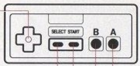
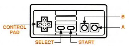
Something that I noticed when going through these manuals was how common yet varied controller diagrams were. In more modern game manuals it’s clear that a diagram has been provided, and possibly required, by the hardware manufacturer, but in these days it was seemingly up to each publisher. I’ll be sharing some of the oddest looking ones in my next post.

The main difference I noticed was most diagrams had a controller with either 3 rectangles or 5 rectangles in the middle of the controller and pretty much never 4. There is still a lot of variation within the 3 and 5 rectangle labels I created, though publishers tended to stick to one diagram. The 3 rectangle style may have been to make the diagram less busy looking. Nintendo mostly used 3 rectangles with a few later exceptions.
Jumping and Attacking
Something that can immediately make a game feel bad is if the jump button is “wrong”. People strongly prefer jumping to be mapped to the A button, but perhaps this was less obvious to developers of the time.
Thankfully, A to jump makes up the majority of games and generally gained ground over time. Not all games have a jump or an attack, but attack has a smaller majority as the B button. The despicable Up to jump was recorded for 12 games.
I was surprised that I only recorded 11 games as having a run button set to A (1 game) or B (10 games). It’s something I associate strongly with platformers, but that may be the Mario influence.
Start and Select
It seems so universal that Start should pause and that Select should select something, yet this was not unanimous. Several games had A+B to pause, which I didn’t record, or referred to opening menus with the Start button, which I didn’t count as pausing.
Select is used less overall, which makes sense as it’s the least convenient button to reach.. Many manuals describe using the Select button to move a cursor on the title screen to the mode that the player wants to play. This seems like an overly cumbersome method when the control pad is available and allows for moving a cursor in two directions.
Notices and Advisories
As I was looking through these manuals I noticed a lot of boilerplate warnings or notices and wanted to document them. Some were a lot more common than others, some were pretty much always exactly the same, and some seemed to be written differently almost every time.
FCC Compliance
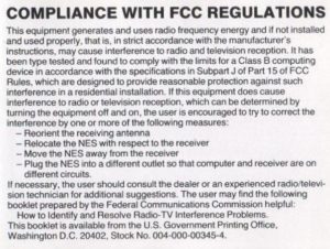
The FCC compliance notices were almost always in the back, but before the warranty information. Some boring legal boilerplate that you see on lots of electronics manuals. For some reason though they seemed to stop doing these late in the NES’s life. Looking at Super Mario World’s (A SNES game) manual now, and there’s no FCC notice and I can’t find any evidence that there was a separate sheet included with this information.
Warranty Notice
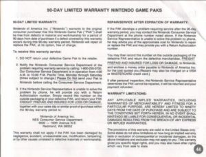
The 90 day warranty notice was the last thing in many manuals, though it was right the front of many Konami manuals. Its rate of inclusion stayed steady throughout the NES’s life, and may have just been omitted by some scanners. I wasn’t able to scrounge up any information about this being a requirement for an officially licensed NES game, but I assume it is.
Game Pak Precautions
Game Pak (as Nintendo insisted on calling their cartridges) precautions were almost always found near the beginning of manuals. This does not include separate warnings/instructions about inserting and removing game paks, although that is often included.
The wording and exact things being cautioned about varied considerably, more than any of the other notices I recorded. Nintendo must have given some guidelines, but let publishers do their own thing with these. The most common warnings were against opening the game pak, subjecting it to extreme heat or cold, touching the pins, cleaning it with thinners, solvents, benzene, or alcohol, playing for too long, sitting too close to the TV, and inserting or removing the game pak when the NES is on.
For whatever reason these warnings became much less common after 1992.

Epileptic Seizure Advisories
I didn’t realize when recording my data just how specific to a time period these warnings were. The pre-1990 warnings were probably later print runs of the manuals. If it was so important to warn about the risk of epileptic seizures, why did they become so rare later on? Were these perhaps moved to a separate slip of paper in the box? These warnings have been included with video game manuals for decades so it seems strange that they disappeared for a time.

Rear Projection TV Warning
Screen burn in was something I heard about a lot as a kid in the 90s, both with TVs and computers. I was constantly worried about it even though none of the TVs I used were projection based.
This is another odd case of a warning peaking in 1992 and then suddenly becoming less included, and in fact not a single 1994 manual has such a warning.

Memo Pages
Memo pages used to be fairly common in manuals. Used for recording passwords, high scores, or just notes to yourself.
I did not count blank pages, but any sort of invitation to write something down, even if it wasn’t a full page, counted.
The most memo pages was 9, in Metal Mech: Man & Machine. Over 28% of the manual was memo. The overall average was 0.51 memo pages per manual.
Game Advertisements
Sometimes publishers advertised their other games in a manual. This does not count non-game ads. It does count ads for games on other systems, which in this case only meant Game Boy and Super Nintendo.
The manuals with the most ads are Rampart and Shatterhand with 16. Both Jaleco games, which did a lot of this cross promotion with essentially a list of games on the back of the manual.
The overall average was 0.78 ads per manual.
Next up is a less statistical look at NES manuals.
Sources
DigitPress was the source of most of the manuals. A few were from ReplacementDocs too.
Wikipedia’s List of Nintendo Entertainment System games.
FLickr user bucky for some higher quality scans, including a color version of Faxanadu.